White Industries Logo

by the patriarch, Bob White
The company had always carried out foundry and machining activities, but by halfway through 1960 it also began producing a range of livestock-feeding equipment which involved fabrication as well.
These products were sold throughout Australia under our own name, and it was soon recognised that a corporate colour scheme should be used. As our clientele was all male, the masculine primary colours of red and yellow were selected.
These colours were not only used for our products, but, as was the custom of the period, were incorporated right through our stationery as well, including letterheads, orders, invoice books, receipts… Indeed, everything carried the red and yellow colour scheme.
By early 1970, the foundry was producing many critical components, such as suspension parts and radiator tanks for several Brisbane heavy-duty truck assembly plants. It was imperative that the manufacturer of these vital parts could be identified for the duration of the components’ life.
I considered that a unique and distinctive logo would serve this purpose and, as well, its use throughout our product range would be beneficial in our marketing efforts.
The company at that time was trading as RG White Industries, and I approached a couple of our advertising agencies for ideas. Several proposals were put forward, mainly using the intertwined initials. These generally looked cluttered, so the idea was shelved for a short time. Also the full company title was a mouthful, so the initials were dropped and the shortened title re-registered. I then returned to the logo project.
It had to be simple, easily cast and yet have punch, so I set about doodling.
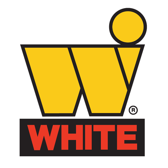
Taking inspiration from the agency proposals, I put together the current form, incorporating the dot from an agency idea – but at that stage without the company name below. This was subsequently registered as a trademark in August 1972.
Some time later, various public companies began developing logos along similar lines, so I set to work to give ours even more distinctive, with extra impact.
Our printed form already carried the block outline around the bright yellow symbol, so I extended this as a background block below the symbol and inserted the name in red lettering. The final design could still be readily cast, and insertion of the company name reinforced the mark itself. This final design was registered in the late seventies.


